Tuesday, July 31, 2012

Essie "Yogaga" Collection Swatches!

Hello! I hope everyone's week is going well :). I am leaving for Disneyland tomorrow with my parents and boyfriend, so I will be gone for the remainder or the week and the duration of the weekend!

Today I wanted to share four polishes I have from Essie's new collection, "Yogaga". I only have four of the six polishes because I ordered them from a seller on ebay in one lot (I only saw these same four polishes at my local Walgreens).

I used two coats for each photo below. The formula of these polishes was ah-mazing. I have no complaints at all with how each applied. Essie always does a good job with their creme-finishes polishes, but lately they've been doing an exceptionally good job!
essie
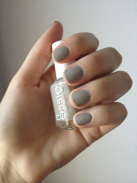
Essie Yogaga
First is the collection's namesake, Yogaga, a greige nude shade. This color kind of reminds me of a mushroom in a sense. I like the color, but I don't think it served its purpose as the main focus of the collection. This is probably my least favorite of the bunch, but it is a unique nude that is work-appropriate. 


essie marathin
Essie Marathin
Marathin is a dusty rose shade. I think this color is nice for fall, but is a little overdone and "safe". Though I do like the color, I feel like I've seen it a few times before. I also think this, too, could be work-appropriate since it is a subdued pink. Also, I'm not too wild about the name. I'm not sure exactly what message Essie is trying to send to women/girls who use their polishes.

essie pilates hottie
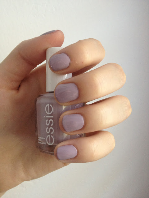
Essie Pilates Hottie
Pilates Hottie is a dusty lilac color. Oh, how I adore this color! I am a sucker for anything lilac/lavender. I think this color could be flattering on many skintones. It naturally is my favorite from the collection, but I am very biased towards purples :P. The name is also very cute, which doesn't hurt!

essie boxer shorts
Essie Boxer Shorts
Boxer Shorts, my runner-up favorite from the collection, is a periwinkle that leans very blue. In person, this polish has more of a purple tinge to it. I like this color a lot. I could see myself wearing it as a transition color from Summer to Autumn. 


Overall, I like "Yogaga", though I did feel that the colors displayed in the collection did not correlate with the collection's theme. Essie chose some beautiful shades and I like them, regardless of my previous comment. I would like to see the other two shades in person, even though I don't think I will be purchasing either (they didn't look as appealing to me online). 

I hope you guys enjoyed these swatches and I hope the rest of your week goes smoothly :)

-Shelby


Monday, July 30, 2012

China Glaze "On Safari" Swatches!

Hey guys! Today I wanted to share the 5 polishes I picked up from China Glaze's fall line, "On Safari". I liked a lot of the colors in the collection, but I only felt I needed five, since I wasn't head over heels for a couple and a few looked similar to shades I already own! The name of the collection, "On Safari", is what truly sold me on the polishes!

The formula of these is pretty good. A couple were on the thick side, but that's to be expected with China Glaze. I applied 2 coats for each photo below. I used a base coat only.

Here's a shot of all the colors :)

china glaze on safari
China Glaze "On Safari" Collection
From left to right: Man Hunt, Purr-fect Plum, Exotic Encounters, I'm Not Lion, Kalahari Kiss


china glaze man hunt
China Glaze Man Hunt
Man Hunt is a royal blue shade with a jelly-like finish. The formula on this color was much thinner than the rest. This was possibly the easiest to apply. I like this color because it's darker than a lot of blue shades, but isn't as dark as a navy. It's somewhere right in the middle, which seems to be perfect for fall. This may be my favorite polish of the collection.  

china glaze purr-fect plum
China Glaze Purr-fect Plum
Purr-fect Plum is a nice warm plum shade. It leans a lot more purple in person, but my camera had a hard time picking it up. This color I feel like would compliment many skin tones. It isn't too warm or too cool, just somewhere in the middle. The name Purr-fect Plum wins second best name in the collection and possibly also my second favorite of the collection!

china glaze exotic encounters
China Glaze Exotic Encounters
Exotic Encounters is a grayed-out teal color. I really enjoy this color! Like the rest of this collection, the shade is very Africa-esque. It reminds me of some of the trees you'd find there. Unfortunately this polish stained my fingers (which is why they look a little tinted in the previous photo). This is my boyfriend's favorite of the bunch :)

china glaze i'm not lion
China Glaze I'm Not Lion
I'm Not Lion is a gold and silver glitter in a clear base. In the sun, some of the glitters flash rainbow, like a holo. The name of this polish is absolutely adorable, and is my favorite of the collection. It reminds me of the Lion King for some reason. I enjoyed that movie a lot as a child and this brings back memories of Simba & Nala. 

china glaze kalahari kiss
China Glaze Kalahari Kiss
Kalahari Kiss is a golden yellow shade. Out of the five that I picked up, this is my least favorite. It isn't the most flattering against my skin-tone, but it may look better on others'. I actually bought it to go underneath I'm Not Lion. I saw the combo on ThePolishAholic and it made me buy the duo. The formula on this one was a little thick, but not unmanageable. 

china glaze i'm not lion
China Glaze Kalahari Kiss and I'm Not Lion
This is the combo of 2 coats of Kalahari Kiss with 1 coat of I'm Not Lion. I like how this combo turned out. It reminds me of a lion almost more than just I'm Not Lion on it's own. It also makes the glitter much easier to take off :P. 


Overall, I liked this collection, especially its concept. I like how China Glaze incorporated nature/animals into a collection. I didn't have an issue with the formula, so overall I was happy. The colors seem to be fall-esque, but still fun and surprisingly vibrant. Another good collection from China Glaze :)


Sunday, July 29, 2012

Wet n' Wild Tropicalia & First Post

Hello! I have been reading nail blogs for quite a few months and today it dawned on me that I should try and make my own. I want to share my nail polish addiction with fellow nail addicts & thought I'd start off my first post with a nail of the day!

The color I'm wearing today is Tropicalia from Wet n' Wild's megalast line. Tropicalia is a nice mid-tone coral shade, leaning more towards pink than orange. The best part about this polish, aside from the gorgeous color, is the price. It's only $1.99 at most drugstores, but can be found on sale for .99! 
For both photos below I did two coats with a base and fast-dry topcoat. 

I had no issues with the application of this polish. It was fairly opaque in one coat, but I did a second to smooth it out. 

Below: Without flash, natural lighting. Looks like a true coral in natural lighting. This color screams beach to me. I can imagine myself wearing it on my toes while tanning on the beach :)

Wet n' Wild Tropicalia


Below: With flash. It leans more pink with flash, but it's a true coral.


wet n wild tropicalia
Wet n' Wild Tropicalia


The only problem I have with this polish (and all the polishes from this line) is the brush. The brush is rather short and wide. The rounded end isn't as much of a problem as the stiffness of the brush itself. It's hard to get onto the sides of the nail due to its lack of flexibility.                                                  
wet n wild tropicalia

Overall, I really like this polish! I think it's a fun shade for spring and summer. It's available at most drugstores, but it's a popular shade and often sold-out. I hope you guys liked this post and I'll be sure to keep posting soon!
Have a great week!
-Shelby